Sexu.Tv
sexu.tv
What the hell is Sexu?
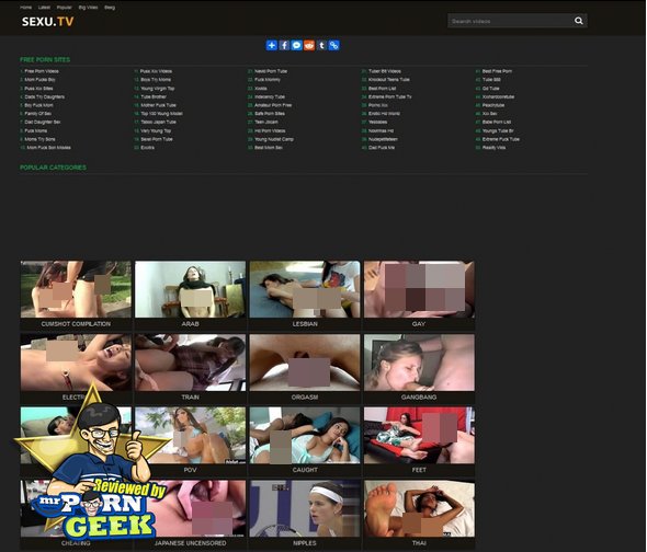
Good question! Sexu appears to be just a collection of links to some porn sites when you first get on it. However, scroll a little further, and the porn links disappear and are replaced by a shit load of porn categories. I am very wary when I see porn categories on a homepage, a lot of the time, sites like these just link to other sites like these and there are a fuck load of broken links that blue-ball the living shit out of you.
However, Sexu has surprised me so far. I have tried videos in about five categories so far and all of them have worked. Not only has all of the porn worked, but all of it was in HD, and all of it was hosted by Sexu. I am shocked, quite frankly, looking at the design of this site, you’d think it would be awful, is this the best-kept porn secret in the world? There’s only one way to find out! Put down your copy of the Karma Stura, grab your lotion and let’s review this site, shall we?
The odd layout of Sexu
As I said, when you first get on Sexu, all you can see is a collection of links to porn sites. It is only when you do a bit of exploring that you find the porn. I’m not sure why Sexu.TV decided to lay their website out like this. What part of the traditional layout of a site that puts the porn to the forefront of the site was it that Sexu didn’t like? Instead, they opted for a site that advertises other sites first and puts all of the porn out of view so for the first few moments of you being on this site, you are debating clicking on one of the links.
I really don’t understand this weird layout from Sexu. On the one hand, it’s great to tell porn viewers about amazing sites, that’s my job, for fuck sake, but why the fuck would you put these porn links smack bang in the middle of the homepage? The rest of Sexu is laid out in a very typical porn site way, it is just this shit that is odd and isn’t needed at all!
The categories on Sexu.TV
There are shit loads of categories on this site. As you scroll down the homepage, the porn categories just keep on coming. These start with the popular categories and then goes down to random categories in no particular order. It would be nice to see the porn categories in some kind of order as this is the way a good way of filtering the porn. There is no pornstar directory, the only other way of filtering the porn is the search bar at the top of the page.
Having so many categories that are just randomly spread across the homepage is a double-edged sword. I respect the number of categories on Sexu, it is truly a impressive amount of categories, but it is difficult to find any particular category that you have in mind. It is much like when Netflix changed their layout, I still can’t find what the fuck I want to watch on Netflix, and I am struggling on Sexu too. In my opinion, Sexu should keep it simple. Most porn viewers just need to get off to some porn and it is nice to be able to navigate around the porn easily, hence the idea for categories. However, by the categories just being completely randomised, it makes it difficult to jerk off. So, I respect the number of categories, Sexu, but you could do better with the layout of them.
Some features I’d love Sexu to add
Of course, I would like Sexu.TV to add a pornstars page to their website. In my opinion, with such a fucking shit load of porn, you need as many ways of filtering through the porn as possible. Having so much porn is a godsend, but not being able to filter through this porn can be frustrating. We want to find the porn we love to watch on your site, Sexu and so adding a pornstars page would help us do this.
I mentioned the odd layout earlier, and I’m going to mention it here too. The layout of this site is too odd for me. For a site with this much free porn on it, you would think Sexu would be encouraging you to stay on their site rather than visit others. I am not saying get rid of the porn links, I am sure they are making you money, but hide them. You have a great thing here Sexu, celebrate it, don’t hide it.
Also, the design of Sexu is slightly strange. When you watch a video, it takes you to a completely differently designed website. It is still Sexu, but it looks much cleaner and more modern. Perhaps consider using that design over the whole porn site, it looks a lot cooler than the shit design on the homepage.
The Geek’s last thoughts on Sexu
I like Sexu.TV, I think it has the potential to be one of the best sites in the world, there are just subtle changes that need to be made first. They need to include more ways of filtering the porn, they need to clean up the homepage and decide on which design they are going to run on the whole site. Having two designs makes the site seem spilt and unfinished, and by putting links to other sites in the guest’s eye line the moment they get on the homepage, it’s as if you’re saying “this site is shit, here are better ones”. This isn’t the case at all, Sexu is a fucking good free porn tube site and one that I will use regularly!
- Surprising amount of porn
- HD porn
- Lots of categories
- Odd design


